Helping sales reps make better decisions with data

Wizcommerce is an early-stage B2B e-commerce technology startup providing tailored marketplace solutions, inventory management, and seamless payment integrations to help retailers and brands optimize their online sales operations
Redesigning
Rethinking
Contribution :
~3 weeks
Collaborated closely with product stakeholders to rapidly iterate and brainstorm solutions, while also partnering with the tech team to ensure seamless translation of designs into production
WizOrder :
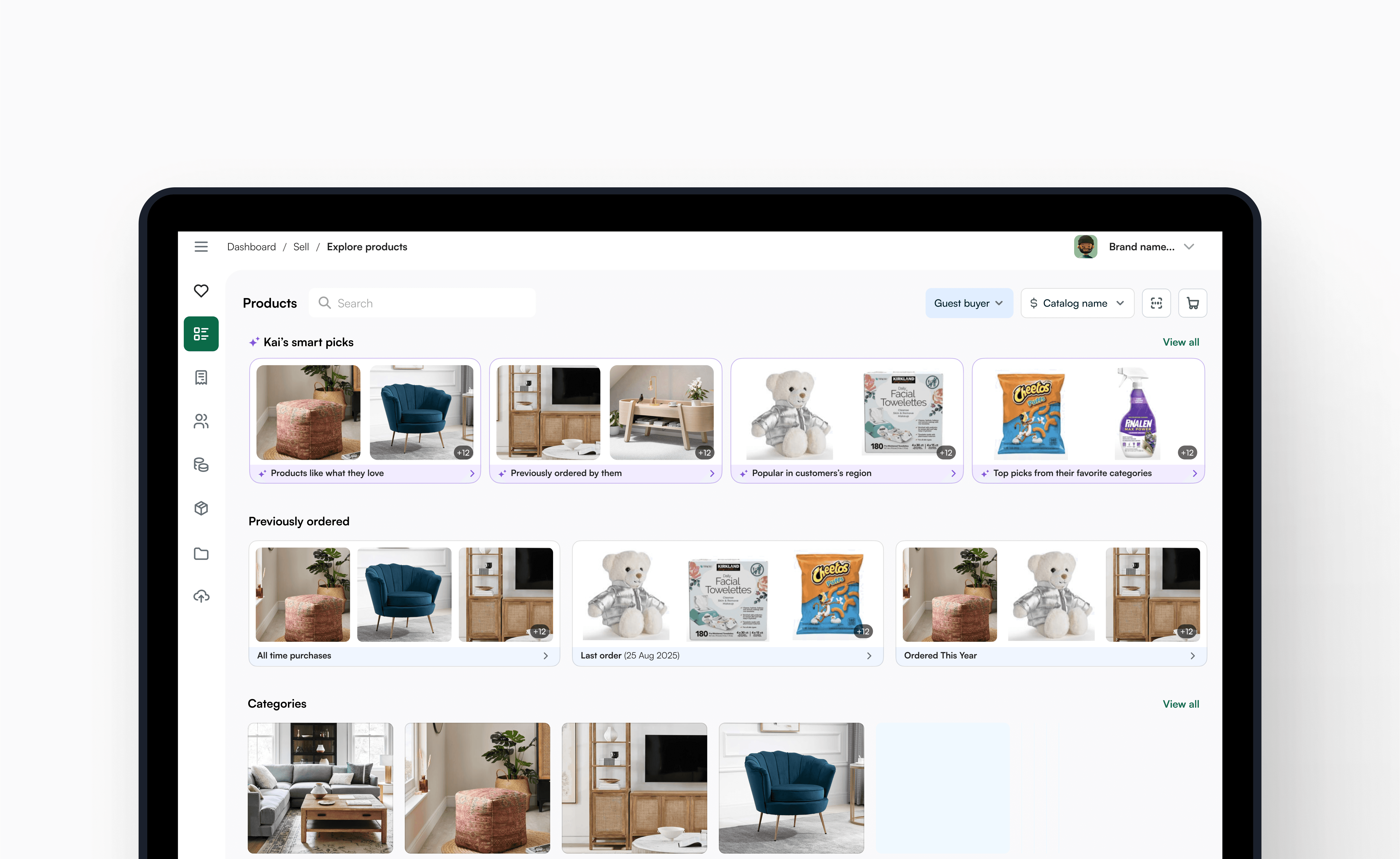
An end-to-end order-taking app that supports the complete sales journey — from browsing product listings and managing carts to creating quotes, confirming orders, and processing payments.
While it's built to handle the full flow, it's especially valuable in the following ways:
> Simplifying product discoverability, eliminating the need to memorize 1000s of SKUs.
> Helping sales reps quickly find and recommend the best products to upsell —boosting sales pipeline efficiency.
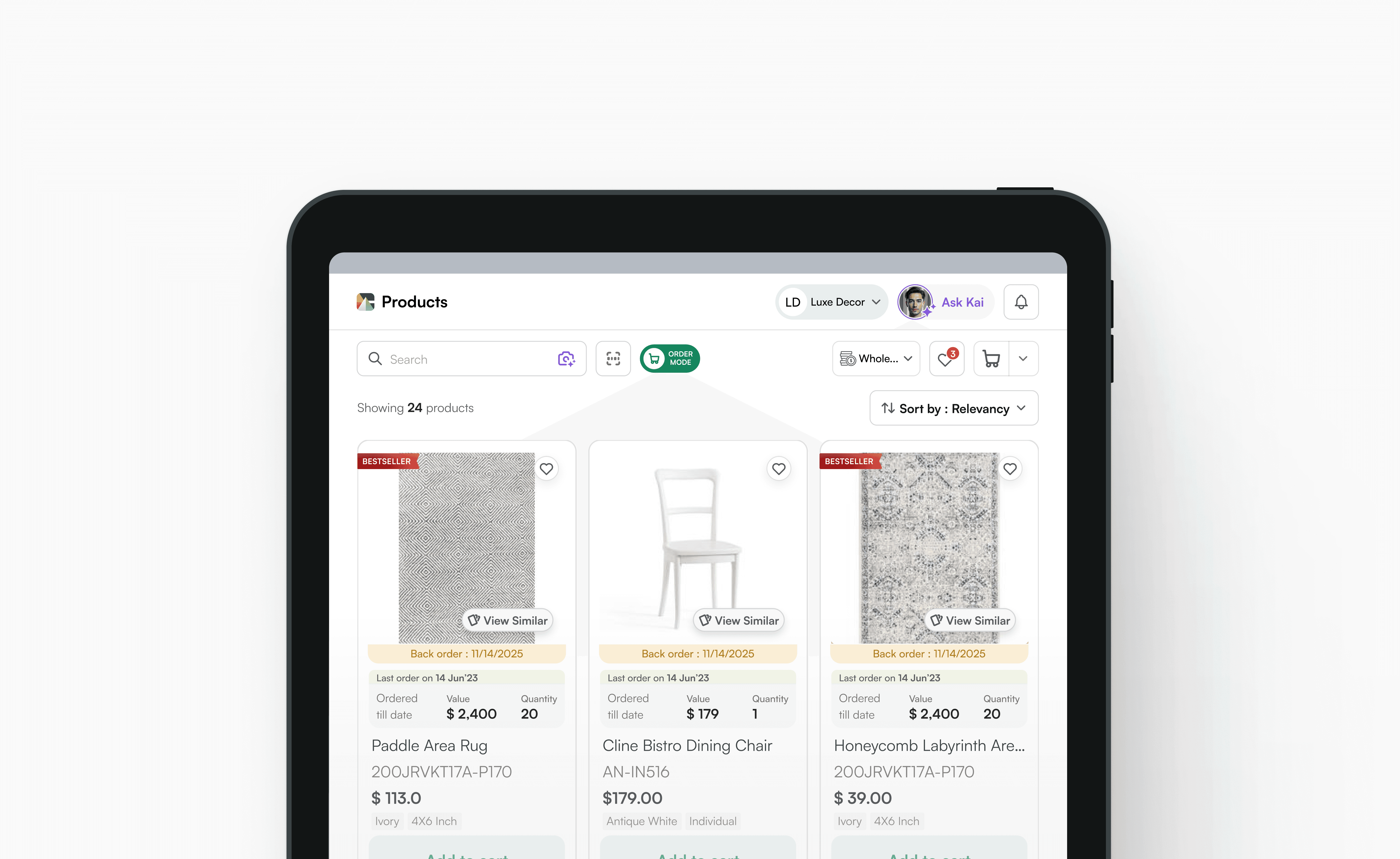
Initial product listing - wizorder
Showing more data upfront helps sales reps make faster, smarter decisions—reducing guesswork, speeding up conversations, and increasing confidence during every step of the sale.
♦️The Redesign of:
1- Product listing card
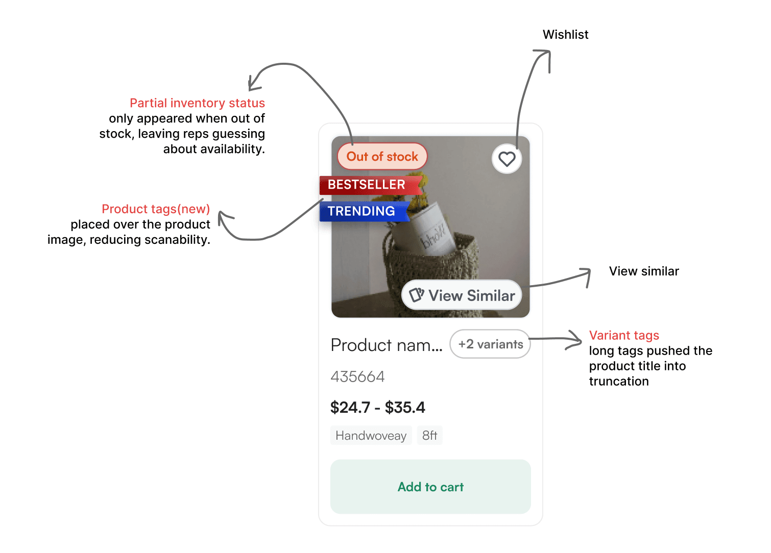
Problem : Reps not being able make quick informed decisions about what products to upsell in calls due to unavailability of relevant information on product card
Goal : Redesign the structure and visual hierarchy of the product card to surface more relevant information/data—improving both readability and scanability for faster decision-making.
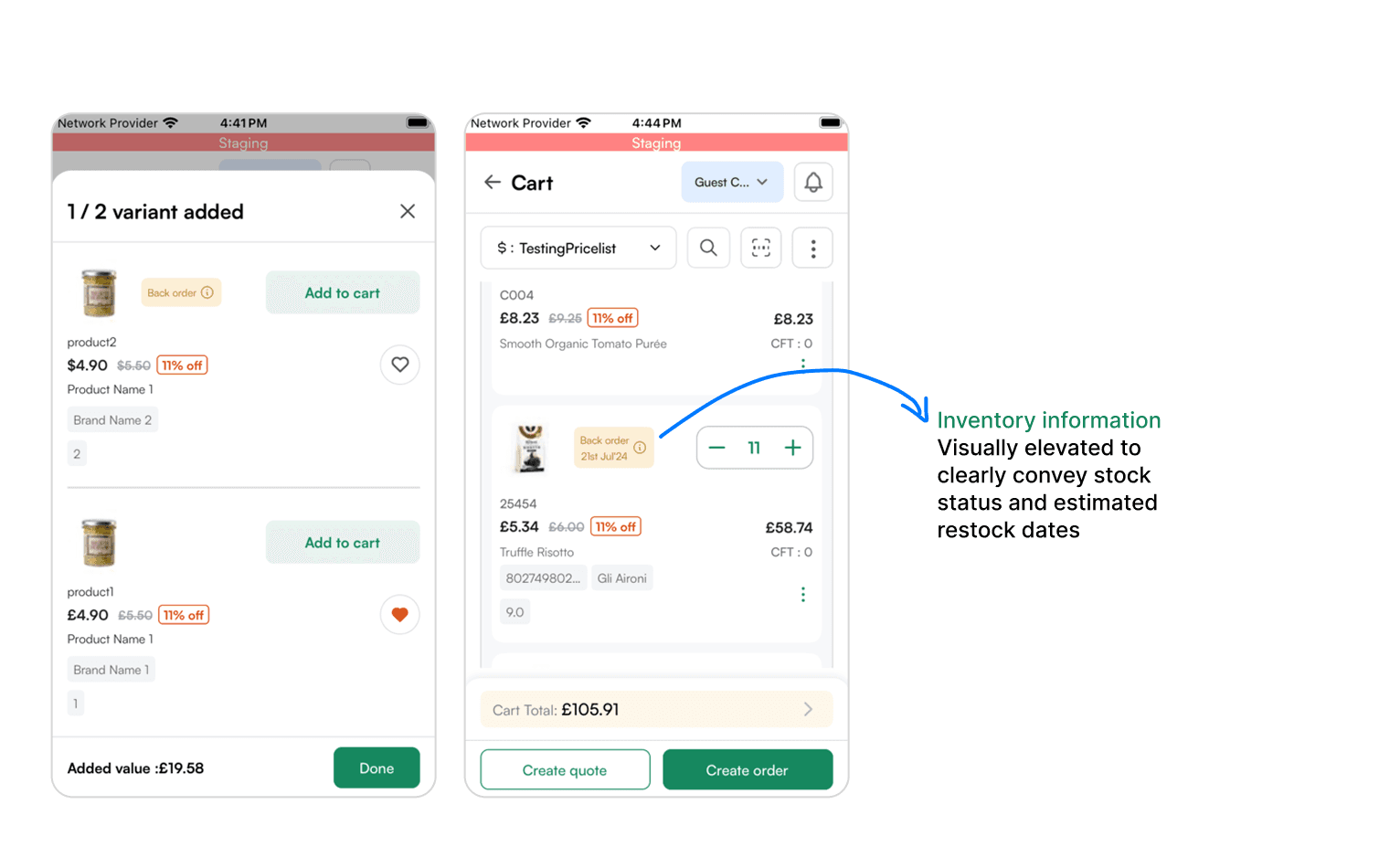
> Stock availability- Instock, On-order, back-ordered, or out of stock
> Restock timelines - Information regarding ETA of shipments delivered to the warehouses
> Variant details - AI based product similar recommendations
> Product tags - Offer based filters and discounts
Before

After (mobile cards)
> Inventory Flags : Coupled inventory/stock and ETA information in a banner adjacent to the image communicating the availability for the same
> Variant details: Moved details into the CTA, cleaning up space for product identifiers (SKUs/Name).
Also the stepper action was made clearer with this, ie - if there were variants existing for a product, Add to Cart would first redirect them to a stepper, where the sales reps would then pick what variant to choose. This action was given more justice by iterating the CTA copy itself.
> Scrolling tags: Added scrolling information tags for even more information. These tags are optional and would be used if an only there were more promotional information about the product.
Variant details - CTA
Scrolling tags
2- Previously bought cards

Before

After
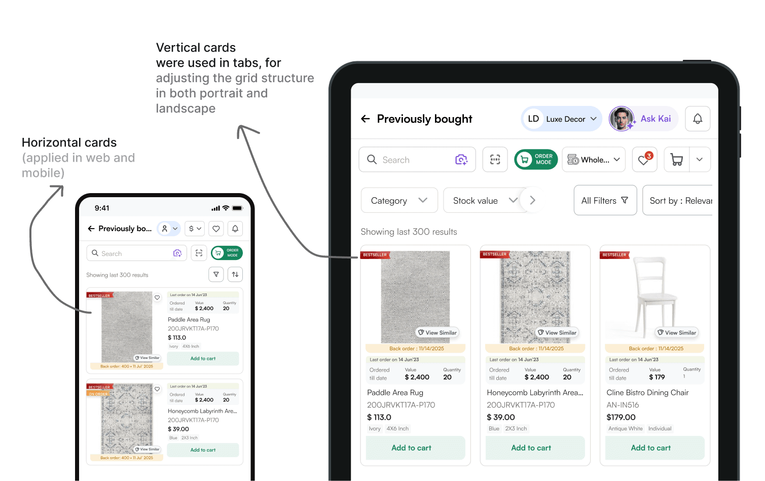
Two different variations of previously bought cards
3- Variant bottom sheets, Cart etc.
Goal : Embed subtle, context-aware data cues within key UI components to support informed decisions in the order taking flow.
> Variant bottom sheets, Cart review
Similar component strip visualising total quantities added as well as other product details
> PDP
Product detail page, a detailed description of the product, enabling user to retrieve information about its properties and stock availability

Redesigned components (mobile)

Tab presentation of cart

Product detail pages with the updated inventory chip
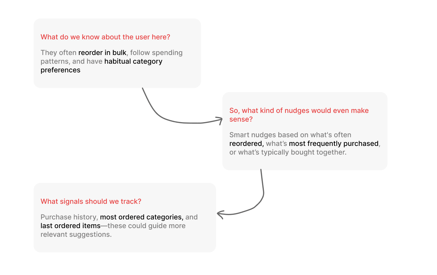
Recommendation rails are dynamic product suggestions powered by AI—tailored to user behaviuor, purchase patterns, or product context.
Initially these were an array of product cards linearly stacked through, the sales reps then had a choice to upsell these products to retailer customers
Recommended rails
We then thought what if we had some grouping patterns that would make the decision making for the reps even more easier?

These grouping patterns are frequently used in B2C settings, where it facilitates a bigger cart size either by suggesting complementary category types or just upselling more of the same.
Still a WIP, but surely something interesting to be working on!
Rethinking grouping pattens for B2B

Redesigned rails

Learnings and impact
Functioning at the core of a 8 member product team, assisting devs and handling conversations with product stakeholders - doing it all seems a lil overwhelming, but surely rewarding enough to see things being implemented and making the way to the screens and business and its ethics
What we build here might not be perfect at the start but surely it has come a long way, understanding the market needs and constantly iterating.