WizCommerce
Your all-in-one B2B commerce solution
Shopify but for wholesalers. Wizcommerce is a classy place where wholesale e-commerce is getting revolutionised, and I happen to be lucky enough to be at center of it!
Introduction
Product cards are the backbone of product discovery on any e‑commerce platform. Whether buyers are browsing, ordering, or just exploring, every interaction hinges on how effectively these cards showcase products. In the end, if product cards don’t convert, there’s no revenue to speak of.

Data and data never ending data
What data?
Stock availability
is it in stock, on order, or back-ordered?
Restock timelines
if it’s out, when is it coming back?
View similar
Wishlist
Bookmarking products
Variant Price Ranges
pricing across different variants
Product tags
useful filters, discounts and offers
Problem

Solution
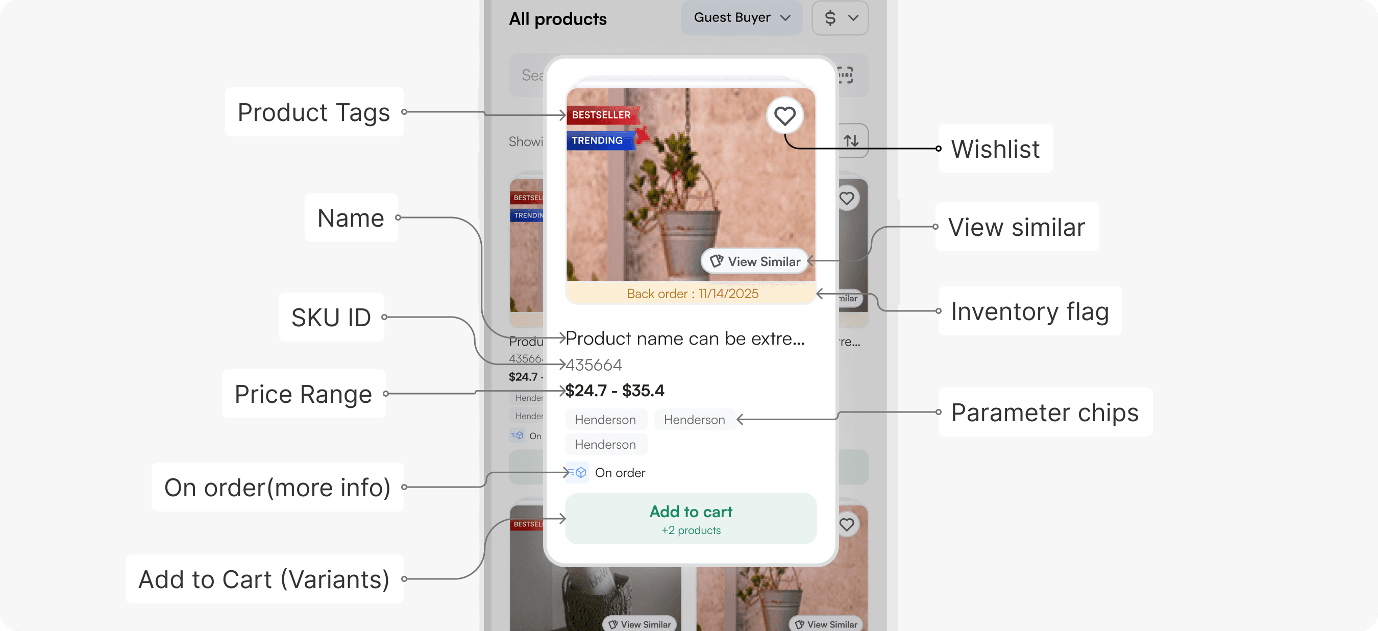
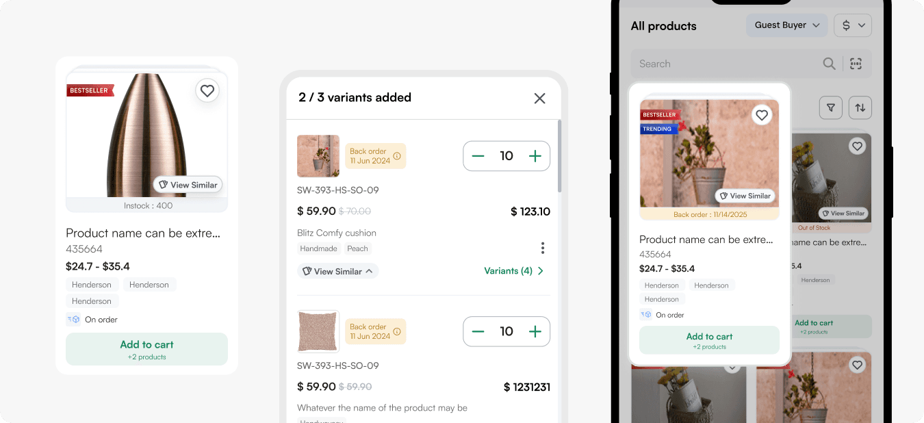
We rebuilt the mobile product card as a bottom‑sheet that layers information by importance—featuring image‑anchored badges for tags and inventory, quick‑access parameter chips, grouped core details (name, SKU, price), tucked‑away “View Similar” and Wishlist actions, a scrollable “On Order” section, and an adaptive “Add to Cart” CTA with variant selection—so reps see exactly what they need, no noise, and the layout scales as we add more data.
How
View similar, Tags and Wishlist
When working with the icons - actions that overlayed the image, It was necessary to keep the visible real estate of the image, and also considering the edge case - what if the image is not centred??
View similar : Sits bottom-right, with visible text instead of just an icon—since it’s a core feature and deserves more attention.

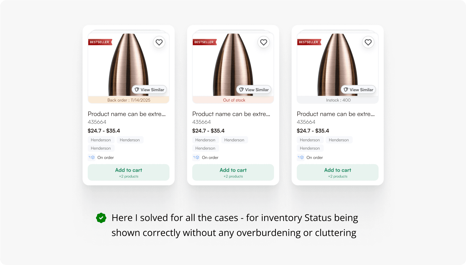
Inventory flags

Scaling this further?
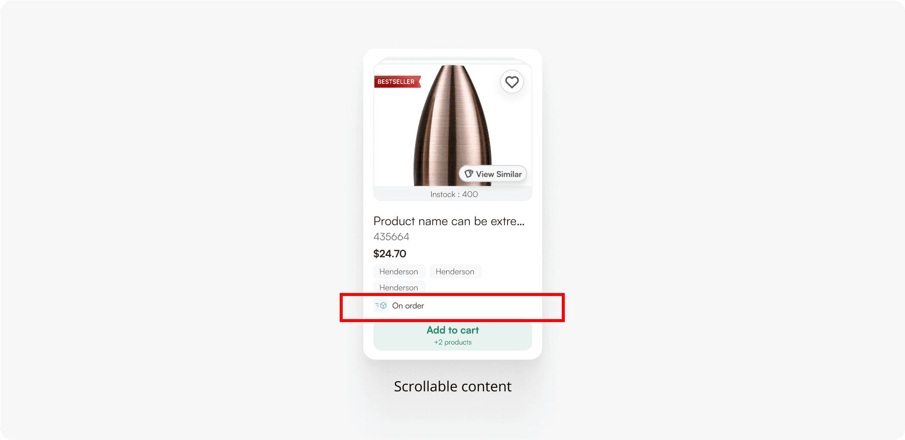
With ever expanding use cases and client requests, we figured out there will be a time where more custom data/more intricate information would be made to show on the product card.
With this thing into consideration it won’t be always possible to Re-do this card. Therefore I came with an idea of a one liner placeholder that could scroll. Companies like Noon, Amazon already do this : but this was an interesting brainstorm and research in-order to arrive at this.
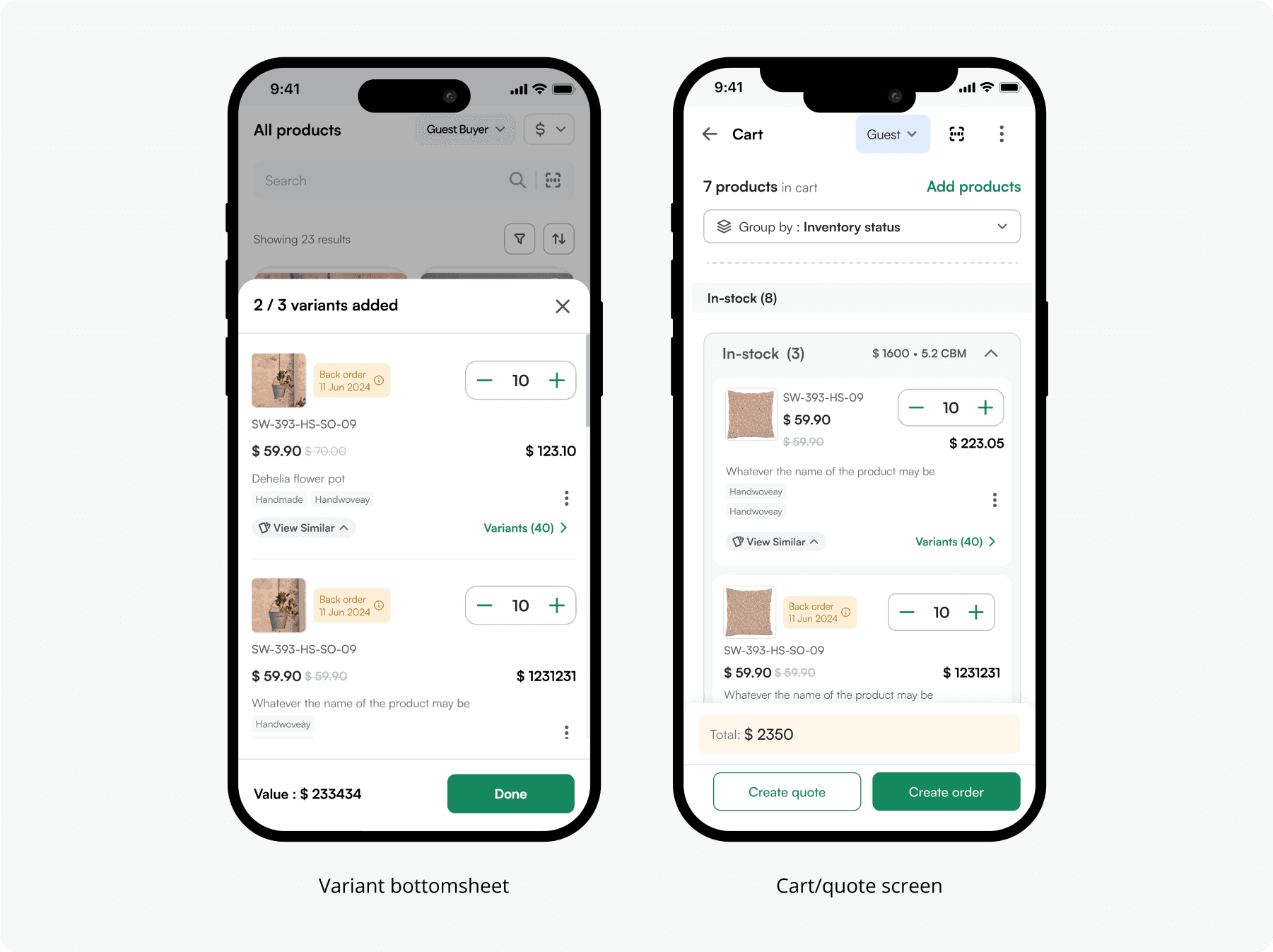
Data propagation
With these product cards in place, a lot of other flows and screens had more inflow of data at hand. And hence all of these cards/rails needed a visual amp up. These changes were significant and scaled through the entire platform across multiple devices as well.


Takeaways
With an ultra short timeline for projects here, it becomes increasingly difficult to maintain proper documentation of design designs and it always becomes a hassle to communicate the same to the devs and other teams. And further even more difficult to make a case study out of it. :P